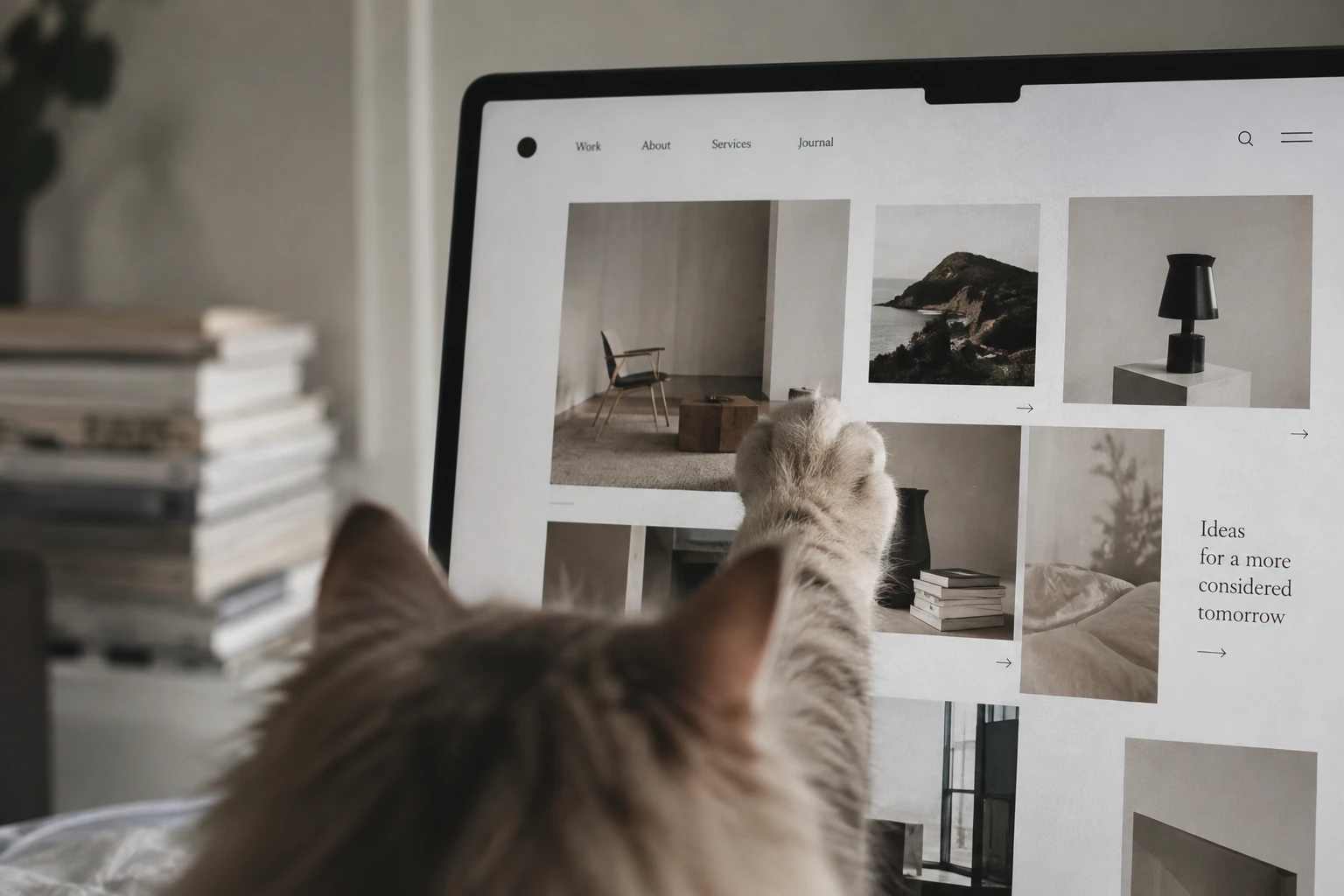
When someone lands on your site for the first time, they're sizing you up and looking for a reason to stick around. By looking at user intent through a feline lens, this guide breaks down 5 key conversion moments—from your hero copy and wayfinding to friction, trust signals, and CTA design.
When a cat walks into an unfamiliar room, it doesn't just crash on the floor. It stands by the door. Sniffs around. Does a lap to check for anything suss. If someone moves too fast, it bails. Find a safe corner, though, and it might hang out a while.
First-time visitors hitting a brand-new website are pretty much the exact same. They aren't landing on your homepage ready to fall in love with your brand straight away.
Is this actually where I need to be? Do you even have what I'm looking for? Why should I trust you lot? Where on earth do I go next?
Once folks land on your site, they're actively hunting for a reason to stay.
Viewed through a cat's eyes, their behaviour actually makes total sense.
01|Cats check the perimeter; clients check 'Is this the right spot?'
A cat's first move in a new space isn't to critique your interior styling. It assesses the environment. Visitors do the exact same thing.
In those first few seconds on site, they aren't admiring your brand ethos, fancy animations, or slick design. They're thinking: "What does this mob actually do? And is the thing I clicked for still here?"
If your hero section is just a vague, pretty tagline with zero clue on who you help, what you fix, or what you sell, you're making them do the heavy lifting. And let's be honest, most users won't bother. So your homepage's primary job isn't telling your whole life story—it's giving the right people a quick thumbs-up: Yep, I'm in the right place.
02|Cats sniff everywhere, and users don't follow your neat user journey
As designers, we love mapping out a neat, linear user flow: Homepage → About Us → Services → Case Studies → Contact Us.
In reality? Rarely happens. People drop straight onto a product page via Google or ChatGPT, jump straight to case studies, open five tabs to compare options, or hunt for pricing right off the bat. They aren't following our planned sequence. Not everyone starts at the homepage.
So no matter what page they land on, you need to anticipate their intent, making it dead simple for them to figure out where they are and where to head next. That's why internal links, related content, navigation, and CTAs aren't just tick-boxes for SEO.

03|Cats bolt if things feel off, and visitors do too
Imagine a cat in a room. Suddenly there's a loud noise, obstacles everywhere, and someone crowding it every two steps. It's not sticking around long.
Your site does the same when weighed down by annoying pop-ups, over-the-top animations, buried info, clunky mobile UX, or a "Contact Us" button plastered on every single scroll. Individually, maybe no big deal. Stacked together? They create enough friction to stress out even the calmest user.
Plenty of sites confuse "I want to show them more" with "Let's cram more stuff on the page." Conversion rates don't just hang on how much info you cram in. It's about how much effort it takes to get an answer.
04|Cats don't trust you just because you say you're a good bloke
Squatting down in front of a stray cat and whispering, "Hey, trust me, I'm a top bloke"? Generally gets you nowhere.
Same goes for brands.
Dropping buzzwords like "industry-leading," "quality first," "trusted partner," or "years of experience" won't magically earn trust. What clients actually look for is proof: "Who have you worked with? What have you actually delivered? What are other people saying?"
Especially when price points go up and buying cycles stretch out, your site's real job is de-risking the decision. It's all about squashing uncertainty. Trust isn't something you can just slap into a line of copy.
05|Finally, cats need a spot they actually want to walk over to
Once a cat decides a space is safe, it'll make a beeline for the food bowl, an empty cardboard box, or a cozy patch of sun.
Users need a clear-cut next step, too. "CONTACT US" is the textbook go-to, but the friction pops up when they wonder: what do I actually get out of reaching out?
Am I locking in a quote? Booking a chat? Checking pricing? Downloading a resource? Asking a question? Or am I about to get ambushed by a rep? The fuzzier your CTA, the higher the mental toll to click. Instead of a generic "Contact Us," spell out exactly what happens on the other side:
Book a 30-minute chat Grab the full pricing breakdown See what's included in our builds
Clarity beats guesswork every time. Let's make that next step obvious.

So, if your traffic's ticking along nicely but enquiries are dead silent, the issue might not be your traffic numbers. If organic search, ads, or socials are driving traffic, but conversions are flat, run through these five quick checks:
- Can users tell what you do within seconds of landing?
- Can visitors coming in from different entry points easily find their next step?
- Is your site cluttered with info that derails decision-making?
- Are you just boasting about how good you are, or backing it up with hard proof?
- Does every key page feature a clear, logical next step?
Once people land on your site, they need a genuine hook to venture deeper. Just like a cat—you can't force 'em to stay.
But you can set the room up so they choose to stick around.